
Crosstabs plot two quantitative variables against each other in an easy-to-interpret chart.
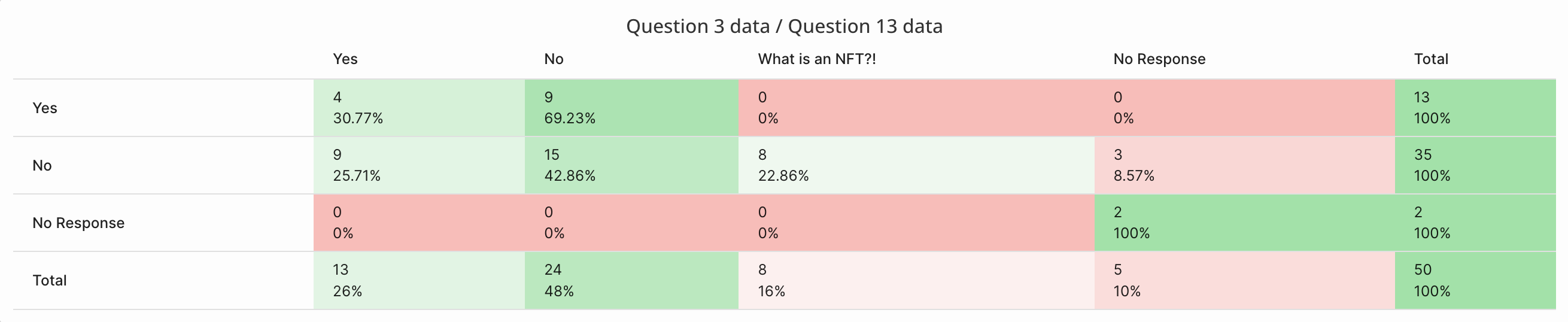
Crosstabs allow you to easily visualize the relationship between two quantitative variables. For example, the crosstab analysis below shows the percentage of participants who responded "Yes" to Question 3, and how this subset of participants responded to Question 13 (with 30.77% responding "Yes" to question 13, and 69.23% responding with "No" to Question 13).
What Data Can I Add To A Crosstab?
Any quantitative data within your survey can be used in a crosstab analysis. This includes:
- Selection, dropdown, slider, ranking, and likert responses
- Gender, Age, Location
- Topics applied to qualitative responses (e.g., audio responses)
- Overall sentiment & sentiment scores
Continuous numerical data (i.e, slider, age, sentiment scores) must be transformed to specify how data should be bucketized.
How Do I Run A Crosstabs Analysis?
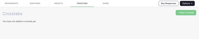
To access Crosstabs, click on your survey of interest and then click on the "Crosstabs" tab. Click "New Crosstab" in the top right corner to get started.
A pop-up window will appear, prompting you to choose two variables to plot against each other. Select the two variables by using the dropdown menus. Only data that can be used in a crosstabs analysis will be shown in the dropdown.
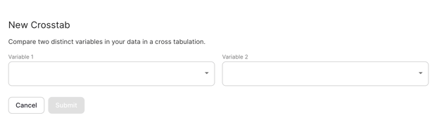
Once the variables have been selected, click "Submit" and your crosstabs analysis will appear.
Variable 1 (left dropdown) will appear on the left of the crosstabs table, while Variable 2 (right dropdown) will appear at the top of the crosstabs table.
Transforming Continuous Data
Continuous numerical data must be transformed in order to be included in a crosstabs analysis. Data transformations simply apply rules to a dataset, which will tell the crosstabs analysis how the continuous data should be grouped or bucketized (e.g., respondents with scores lower than 5 should be grouped together, and those with scores equal to or higher than 5 should be grouped together).
Continuous data includes:
- Slider responses
- Age
- Sentiment scores
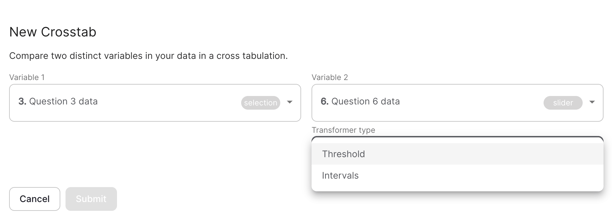
When a continuous variable is selected within the crosstabs pop-up, you will be prompted to choose how this data will be transformed. Data can be transformed in one of two ways: by applying a threshold, or applying intervals.
Threshold Transformations
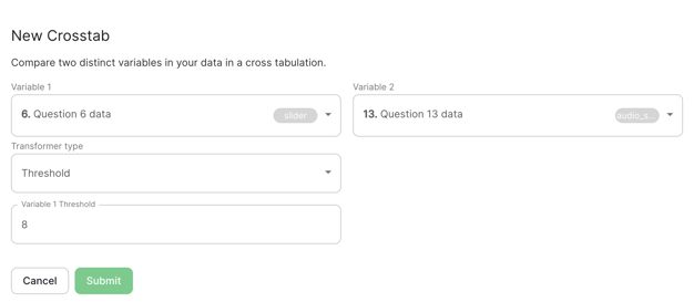
Threshold transformations essentially dichotomize your data: respondents with scores below the threshold are grouped together, and those with scores equal to or above the threshold are grouped together. For example, in the question below, respondents could provide a rating of their investment risk-level, on a scale of 1-10.

In the crosstab pop-up below, the threshold for this variable ("investor risk-level") is set to 8. This means that respondents with scores equal to or greater than 8 will be grouped together, while those with scores below 8 will be grouped together. In this case, we're particularly interested in differences between high-risk investors and all other risk-level investors.
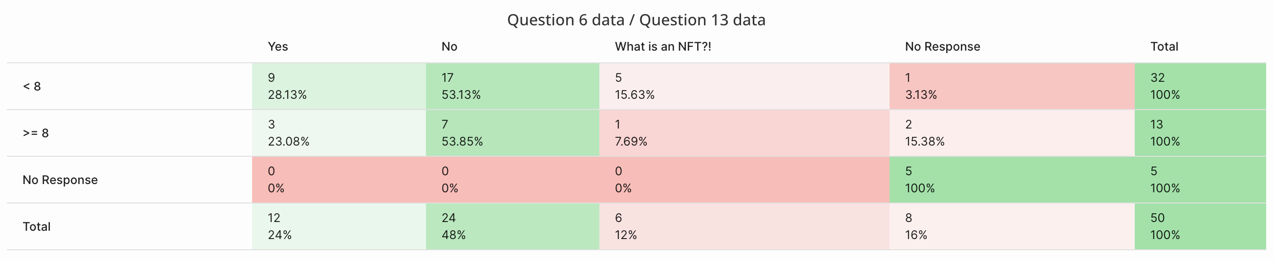
In the crosstabs output below, the continuous data has been sorted into two buckets: < 8 or > = 8 (seen on the left).
Interval Transformations
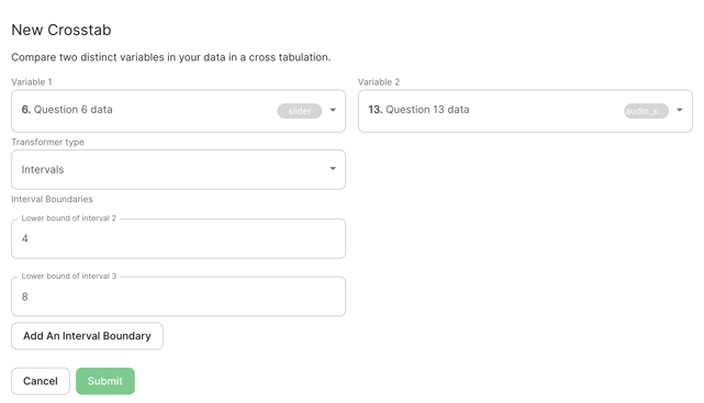
Interval transformations use similar logic to threshold transformations, however, applying intervals allows you to sort data into more than two groups (i.e., for non-dichotomous variables). Using the same example as above, the data can be sorted into 3 intervals. The first interval always contains a lower bound of 0, and thus does not need to be specified. In the example below, the second interval has a lower bound of 4, and the third has a lower bound 8.
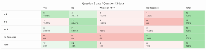
In the crosstabs output below, the continuous data has been sorted into three buckets: < 4, or 4 - 8, or > = 8 (seen on the left).
Have a question about crosstabs? Let us know at contact@phonic.ai.